Candy Demand Forecasting: A Step-by-Step Guide
Discover How We Used Machine Learning to Unlock Insights into Candy Sales
Introduction
Forecasting demand is critical to business planning, enabling companies to optimize inventory, allocate resources, and plan marketing campaigns effectively. In this project, we use machine learning techniques and historical sales data to predict future candy sales. By utilizing data analysis, feature engineering, and predictive modeling, we seek to identify patterns and provide useful insights that support well-informed decision-making.
From data preparation to forecasting outcomes, this guide explains each step in detail to guarantee a thorough understanding of the guide.
Data Understanding
A US national candy distributor's sales and geospatial factory-to-customer shipment data, including customer and factory locations, sales orders and goals, and product details, were used for this project.
Here is a summary of the columns:
- Row ID: Unique identifier for each row.
- Order ID: Unique identifier for orders.
- Order Date: The date the order was placed.
- Ship Date: The date the order was shipped.
- Ship Mode: Shipping method.
- Customer ID: Unique customer identifier.
- Country/Region: Geographic location.
- City: City where the order was placed (542 unique cities).
- State/Province: State or province.
- Postal Code: Postal code of the order location.
- Division: Candy type.
- Region: Geographic region.
- Product ID: Unique identifier for products.
- Product Name: Name of the candy product.
- Sales: Total sales value per order.
- Units: Number of units sold per order.
- Gross Profit: Profit generated per order.
- Cost: Cost incurred per order.
Hello there!
My name is Chinonso Nnaji, and I am a data scientist. I write about data science and machine learning. Follow me to receive updates when the next article is published. You can also connect with me on LinkedIn or Facebook.
Data Preparation
Before we go ahead to prepare our data for the objective of the project. Let’s import the necessary libraries and the dataset:
# Let's import the required libraries
import pandas as pd  # For data manipulation and analysis
import numpy as np   # For numerical operations
import matplotlib.pyplot as plt  # For creating visualizations
import seaborn as sns  # For advanced visualizations

import warnings  # To manage warnings during analysis
warnings.filterwarnings("ignore") # Ignore warnings to keep the notebook clean

# Additional setup to ensure our plots are visible
plt.style.use("ggplot")  # Styling plots to be easier on the eyes
sns.set_palette("deep")  # Setting a default color palette for better visualization aesthetics

# Let's import the Candy sales data
candy_sales_data = pd.read_csv("Candy_Sales.csv")
Next, we will check the first few rows of our dataset:
# Display the first few rows of the candy sales dataset
candy_sales_data.head()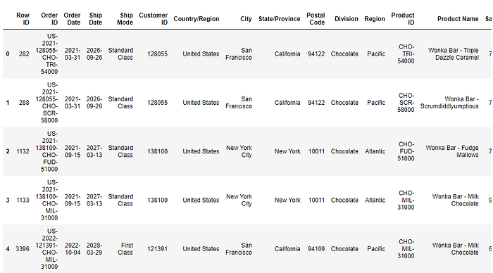
We will also check the number of rows and columns in our dataset:
# Checking the shape of the dataset to understand the number of rows and columns
candy_sales_data.shape
As can be seen from the above image, our dataset consists of 10,194 rows and 18 columns.
Now, let us look up the dataset’s details:
# Checking the information about the dataset to understand data types, non-null counts, and memory usage
candy_sales_data.info()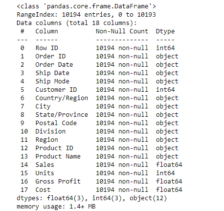
The dataset contains 18 columns and 10,194 rows with no missing values. It includes numerical (float64, int64) and categorical (object) data types. Key columns like Sales, Units, and Gross Profit are numeric, while Order ID, Order Date, and Division are categorical. Memory usage: 1.4 MB.
Since there are no missing values, we will examine the dataset to see if any duplicate rows exist:
# Check for duplicate rows in the dataset
duplicate_rows = candy_sales_data.duplicated().sum()

duplicate_rows
We will proceed since there are no duplicate rows in our dataset.
Let’s check for inconsistent or unusual values in key columns:
# Check for inconsistent or unusual values in key columns
# Verify data types and ranges for numerical columns
numerical_summary = candy_sales_data[["Sales", "Units", "Gross Profit", "Cost"]].describe()

# Check for unusual shipping modes or inconsistent categorical values
unique_shipping_modes = candy_sales_data["Ship Mode"].unique()
unique_countries = candy_sales_data["Country/Region"].unique()
unique_divisions = candy_sales_data["Division"].unique()

# Summarize findings
numerical_summary, unique_shipping_modes, unique_countries, unique_divisions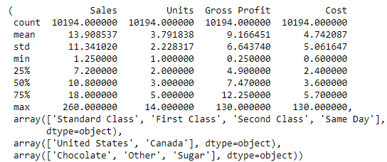
As you can see from the image above, there are no inconsistencies.
We will now get our data ready. The following steps will be taken:
- Convert Date Columns:
We will transform theOrder Datecolumn into a datetime format to enable time-series analysis. - Aggregate Data:
The data by month will be grouped to focus on monthly trends, summarizing key metrics such as:
- Total Sales
- Total Units sold
3. Period Creation:
Extract monthly periods (Month) for easier time-based aggregation and trend identification.
4. Datetime Conversion:
The monthly period will be converted back into a timestamp format to allow plotting and time-series modeling.
What is the thought process behind these steps?
The thought process behind data preparation for demand forecasting focuses on ensuring the data is structured, clean, and ready for time-series analysis.
Here’s the reasoning step-by-step:
- Understanding the business problem: Demand forecasting requires analyzing trends over time. The sales data typically arrives as transactional records, often granular and scattered. To identify monthly or seasonal trends, we aggregated the data to a higher-level time unit like months.
- Why convert Order Date to Datetime: Datetime format allows operations like sorting, grouping, and extracting time-based features (month, quarter, year). It enables consistent time-based analysis, which is essential for time-series forecasting.
- Why aggregate by month? Demand forecasting often deals with monthly or seasonal trends, not individual daily fluctuations. Aggregating by month reduces noise from random daily variations and helps capture broader patterns. An example, monthly sales reveal seasonality, growth trends, or dips.
- Extracting key features (Month, Year, Quarter): Month/Year captures temporal trends and ensures the model understands seasonality. Quarter/season helps group months into broader periods for businesses that plan quarterly.
- Why aggregate sales and units? The total sales provide the target variable for forecasting. The units help identify volume trends alongside revenue trends.
- Ensuring Timestamp for Time-Series Models: Many time-series models (like ARIMA or Prophet) require a proper time index. Converting the month column back to a timestamp ensures compatibility with forecasting libraries and tools.
Let’s do this:
# Convert 'Order Date' to datetime format and ensure the data is ready for aggregation
candy_sales_data["Order Date"] = pd.to_datetime(candy_sales_data["Order Date"])
# Aggregate the sales data by month to prepare for demand forecasting
candy_sales_data["Month"] = candy_sales_data["Order Date"].dt.to_period("M")
monthly_sales_data = candy_sales_data.groupby('Month').agg({
"Sales": "sum", # Summing up sales for each month
"Units": "sum" # Summing up units sold for each month
}).reset_index()
# Convert 'Month' back to a datetime format for easier analysis
monthly_sales_data["Month"] = monthly_sales_data["Month"].dt.to_timestamp()
# Display the prepared data
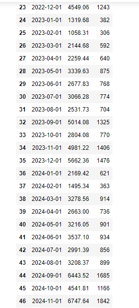
monthly_sales_data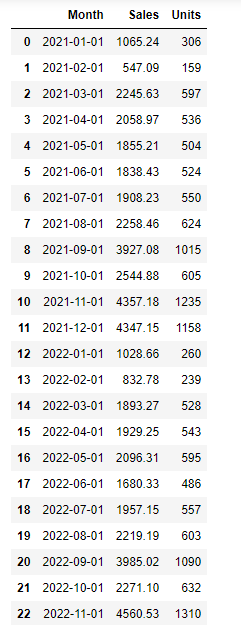
Exploratory Data Analysis (EDA)
Exploratory Data Analysis is an essential part of any data science project. Here are the key steps and visualizations used in the EDA phase of this project:
Monthly Sales Trend:
# Plot sales trends over time to explore patterns and seasonality
plt.figure(figsize=(12, 6))
plt.plot(monthly_sales_data["Month"], monthly_sales_data["Sales"], marker="o", linestyle="-", label="Sales ($)")
plt.title("Monthly Sales Trend", fontsize=16)
plt.xlabel("Month", fontsize=14)
plt.ylabel("Total Sales ($)", fontsize=14)
plt.grid(True)
plt.legend()
plt.show()
This code visualizes monthly sales trends over time, highlighting patterns and seasonality. It plots total sales with markers, adds labels, a title, a grid for clarity, and a legend.
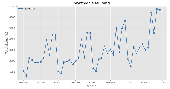
This visualization displays monthly sales trends over time, capturing both fluctuations and potential seasonality. The x-axis represents months from January 2021 to January 2025, while the y-axis shows total sales in dollars. Sales exhibit significant variability, with frequent peaks and dips, indicating irregular yet recurring patterns. Notably, there are sharp increases in early 2022, mid-2023, and late 2024, suggesting potential seasonal demand spikes. Periods with lower sales appear sporadic, possibly due to external factors like promotions, holidays, or market behavior. The overall trend shows growth, particularly towards the end of 2024, where sales peak dramatically, indicating increasing demand.
Monthly Units Sold Trend
# Plot units sold trends over time
plt.figure(figsize=(12, 6))
plt.plot(monthly_sales_data["Month"], monthly_sales_data["Units"], marker="o", linestyle="-", label="Units Sold")
plt.title("Monthly Units Sold Trend", fontsize=16)
plt.xlabel("Month", fontsize=14)
plt.ylabel("Units Sold", fontsize=14)
plt.grid(True)
plt.legend()
plt.show()
The code plots monthly trends for units sold, displaying patterns over time with markers, gridlines, and labeled axes for clarity.
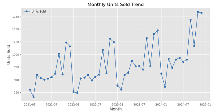
This line chart visualizes monthly units sold from January 2021 to January 2025. The x-axis represents months, while the y-axis shows the total units sold. The trend exhibits significant variability, with recurring peaks and dips, indicating inconsistent demand. Notably, sharp increases occur in late 2021, mid-2023, and late 2024, suggesting periods of heightened activity. Periods of lower sales (e.g., early 2022 and early 2024) highlight potential lulls or seasonal declines. The overall trend shows an upward trajectory, with units sold peaking sharply toward the end of 2024, signifying growing demand and improved sales performance in recent months.
Distribution of Monthly Sales
# Visualization of Sales Distribution
plt.figure(figsize=(10, 6))
plt.hist(monthly_sales_data["Sales"], bins=15, color="skyblue", edgecolor="black")
plt.title("Distribution of Monthly Sales", fontsize=16)
plt.xlabel("Sales ($)", fontsize=14)
plt.ylabel("Frequency", fontsize=14)
plt.grid(axis="y", linestyle="--", alpha=0.7)
plt.show()
The code creates a histogram to visualize the distribution of monthly sales, showing frequency across sales ranges with gridlines and labels.
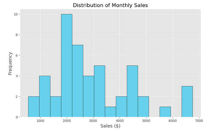
This histogram displays the distribution of monthly sales across different sales ranges. The x-axis represents total sales values in dollars, while the y-axis shows the frequency (number of months) for each sales range. The distribution reveals that most monthly sales fall between $1000 and $3000, with the highest frequency occurring around $2000. There are fewer months with very high sales (e.g., $5000–$7000), indicating these are outliers or exceptional periods. The spread suggests variability in monthly performance, with occasional peaks. This analysis highlights typical monthly sales ranges, helping businesses understand sales consistency and identify high-performing periods.
Units Sold vs. Sales
# Scatter Plot: Units Sold vs Sales to check correlation
plt.figure(figsize=(10, 6))
plt.scatter(monthly_sales_data["Units"], monthly_sales_data["Sales"], color="skyblue", alpha=0.7)
plt.title("Units Sold vs Sales", fontsize=16)
plt.xlabel("Units Sold", fontsize=14)
plt.ylabel("Sales ($)", fontsize=14)
plt.grid(True, linestyle="--", alpha=0.7)
plt.show()
The code creates a scatter plot to visualize the relationship between units sold and sales, checking for correlation and distribution patterns.
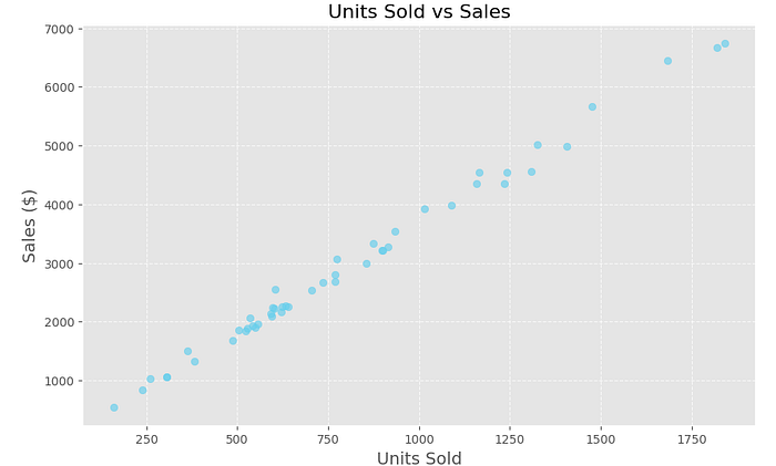
This scatter plot shows the relationship between Units Sold (x-axis) and Sales (y-axis). The points form an upward trend, indicating a strong positive correlation: as units sold increase, sales consistently rise. The relationship appears linear, meaning sales are proportional to units sold. Higher units (above 1500) lead to significantly higher sales values (above $6000). This trend confirms that units sold strongly drive total sales performance.
Feature Engineering
Feature engineering is placed at this stage of the project because it bridges the gap between data preparation and model building, ensuring that the dataset is enriched with meaningful information that improves model accuracy.
We will create new features to enhance the predictive power of the model. This is how I will create the new features:
- Time-Based Features:
- Extract key temporal components:
- Year: To capture yearly trends.
- Quarter: Divide the year into quarters for seasonal insights.
- Month_Num: Represent the month as a numerical value to identify monthly patterns.
- Season: Derive the season (1=Winter, 2=Spring, etc.) from the month.
2. Rolling Statistics:
- Calculate 3-month rolling averages for:
- Sales: To smooth out short-term fluctuations and capture trends.
- Units: To observe the moving average of units sold over three months.
3. Lagged Features:
- Create lagged values to incorporate the previous month’s data:
- Lagged_Sales: Sales from the previous month.
- Lagged_Units: Units sold in the previous month.
- These features help the model understand historical trends and dependencies.
4. Normalized Metrics:
- Derive Sales per Unit:
- A normalized metric to measure the average sales value per unit sold.
Let’s do this:
# Extracting time-based features
monthly_sales_data["Year"] = monthly_sales_data["Month"].dt.year
monthly_sales_data["Quarter"] = monthly_sales_data["Month"].dt.quarter
monthly_sales_data["Month_Num"] = monthly_sales_data["Month"].dt.month
monthly_sales_data["Season"] = monthly_sales_data["Month"].dt.month % 12 // 3 + 1  # 1=Winter, 2=Spring, etc.

# Rolling statistics (3-month rolling average for Sales and Units)
monthly_sales_data["Rolling_Sales"] = monthly_sales_data["Sales"].rolling(window=3).mean()
monthly_sales_data["Rolling_Units"] = monthly_sales_data["Units"].rolling(window=3).mean()

# Step 3: Lagged Features (Sales and Units from the previous month)
monthly_sales_data["Lagged_Sales"] = monthly_sales_data["Sales"].shift(1)
monthly_sales_data["Lagged_Units"] = monthly_sales_data["Units"].shift(1)

# Step 4: Normalized Metrics
monthly_sales_data["Sales_per_Unit"] = monthly_sales_data["Sales"] / monthly_sales_data["Units"]

# Display the updated dataset
monthly_sales_data.head()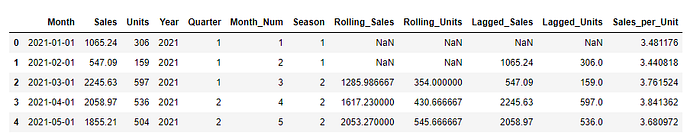
You will notice that there is “NAN” in the data after new features are created.
The next question to be asked is; why?
Missing values occurred because:
- Lagged Features: These rely on previous months’ data. The first row has no prior data, resulting in a missing value.
- Rolling Averages: Calculating 3-month rolling averages requires values from the preceding two months. For the first two rows, there isn’t enough data to compute the average.
Let’s drop the missing values:
# Drop rows with missing values as they occur due to rolling and lagging calculations
# These rows are not useful for model training
cleaned_monthly_sales_data = monthly_sales_data.dropna().reset_index(drop=True)

# Display the cleaned dataset for verification
cleaned_monthly_sales_data.head()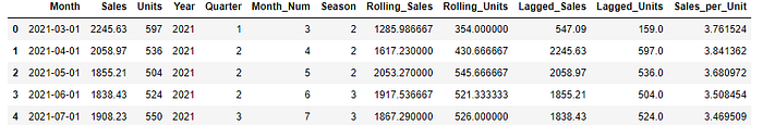
Model Building
We will train our model using the Random Forest in this phase.
Let’s import the necessary libraries:
from sklearn.model_selection import train_test_split
from sklearn.ensemble import RandomForestRegressor
from sklearn.metrics import mean_absolute_error, mean_squared_error
Next, we define the target variable (sales) and features:
# Define the target variable (Sales) and features
target = "Sales"
features = ["Rolling_Sales", "Lagged_Sales", "Rolling_Units", "Lagged_Units", "Sales_per_Unit",
            "Quarter", "Month_Num", "Season"]
In case there are missing values, we drop them:
# Drop rows with any missing data in the selected columns (as a safety measure)
model_data = cleaned_monthly_sales_data.dropna(subset=[target] + features)
Now, we will split the data into training and testing sets:
# Split into training and testing sets (80% train, 20% test, keeping time-series order)
train_size = int(len(model_data) * 0.8)
train_data = model_data.iloc[:train_size]
test_data = model_data.iloc[train_size:]

X_train, y_train = train_data[features], train_data[target]
X_test, y_test = test_data[features], test_data[target]
Then, we train the model and make predictions:
# Train a Random Forest Regressor
model = RandomForestRegressor(n_estimators=100, random_state=42)
model.fit(X_train, y_train)

# Make predictions
y_pred = model.predict(X_test)
Model Evaluation
In this step, we will evaluate the mode with various metrics.
Let’s evaluate the Random Forest:
# Evaluate the model
mae = mean_absolute_error(y_test, y_pred)
rmse = np.sqrt(mean_squared_error(y_test, y_pred))

# Display evaluation metrics
mae, rmse
The values represent Mean Absolute Error (886.2) and Root Mean Square Error (1119.3), measuring model accuracy, with RMSE penalizing larger prediction errors more heavily.
Let’s visualize the predicted sales vs the actual sales:
# Visualize Predicted vs Actual Sales
plt.figure(figsize=(12, 6))
plt.plot(test_data["Month"], y_test, marker="o", label="Actual Sales")
plt.plot(test_data["Month"], y_pred, marker="x", linestyle="--", label="Predicted Sales")
plt.title("Predicted vs Actual Sales", fontsize=16)
plt.xlabel("Month", fontsize=14)
plt.ylabel("Sales ($)", fontsize=14)
plt.legend()
plt.grid(True)
plt.show()
The code compares predicted sales with actual sales over time. It plots two line graphs: one for actual values (markers: circles) and another for predictions (markers: x’s, dashed line). The chart includes gridlines, labeled axes, a legend, and a title to clearly visualize model performance trends.
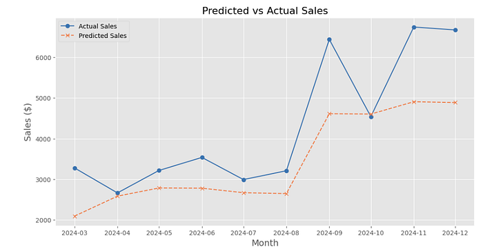
This chart compares actual sales (solid blue line) to predicted sales (dashed orange line) over months. Predictions align moderately well but underestimate sharp increases in September and November 2024. The model captures general trends but struggles with spikes, indicating it might benefit from tuning or additional features to improve accuracy.
Next, we will check the features that influenced our Random Forest:
# Extract feature importance from the trained Random Forest model
feature_importance = model.feature_importances_

# Create a DataFrame for visualization
importance_df = pd.DataFrame({
    "Feature": features,
    "Importance": feature_importance
}).sort_values(by="Importance", ascending=False)

# Visualize feature importance
plt.figure(figsize=(10, 6))
plt.barh(importance_df["Feature"], importance_df["Importance"], color="skyblue")
plt.title("Feature Importance in Random Forest Model", fontsize=16)
plt.xlabel("Importance", fontsize=14)
plt.ylabel("Feature", fontsize=14)
plt.gca().invert_yaxis()  # Invert y-axis for better readability
plt.grid(axis="x", linestyle="--", alpha=0.7)
plt.show()
This code extracts feature importance from a trained Random Forest model, ranks features by importance, and visualizes them in a horizontal bar chart. It highlights which features contribute most to predictions, providing insight into key drivers influencing the model’s output for better interpretability and refinement.
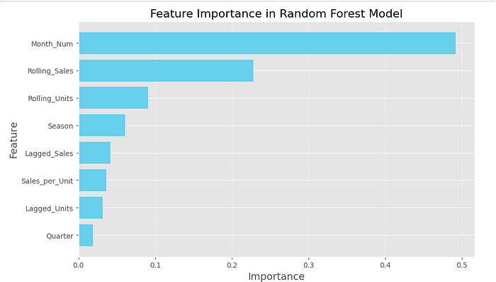
This bar chart shows the feature importance from the Random Forest model, indicating the contribution of each feature to sales predictions. Month_Num is the most influential feature, explaining nearly half the model's predictions, likely capturing seasonality and monthly trends. Rolling_Sales and Rolling_Units are also significant, highlighting historical performance. Features like Season, Lagged_Sales, and Sales_per_Unit provide smaller contributions, showing that temporal trends and past values drive the forecasting results.
Let’s prepare new data for future sales forecasting:
# Prepare data for future sales forecasting
# Using the last row of cleaned data as the base for new predictions
latest_data = cleaned_monthly_sales_data.iloc[-1]

# Generate future periods (e.g., next 6 months)
future_months = pd.date_range(start=latest_data["Month"], periods=7, freq="MS")[1:]

# Create a DataFrame for future predictions
future_data = pd.DataFrame({
    "Month": future_months,
    "Quarter": future_months.quarter,
    "Month_Num": future_months.month,
    "Season": future_months.month % 12 // 3 + 1,  # Calculate season
    "Rolling_Sales": [latest_data["Rolling_Sales"]] * len(future_months),
    "Rolling_Units": [latest_data["Rolling_Units"]] * len(future_months),
    "Lagged_Sales": [latest_data["Sales"]] * len(future_months),
    "Lagged_Units": [latest_data["Units"]] * len(future_months),
    "Sales_per_Unit": [latest_data["Sales_per_Unit"]] * len(future_months)
})
This code prepares data for future sales forecasting by generating features for the next 6 months. It uses the last row of cleaned data as a reference, creating future months, quarters, and seasons while replicating rolling averages, lagged values, and normalized metrics. The resulting DataFrame serves as input for model predictions.
Next, we predict the future sales:
# Predict future sales
future_data["Predicted_Sales"] = model.predict(future_data[features])

# Display the future predictions
future_data[["Month", "Predicted_Sales"]].head()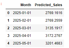
This table shows the predicted sales for the first five months of 2025. Sales are expected to increase gradually, starting at $2769 in January and rising to $3201 by May.
Insights
- Key Drivers of Sales:
- Month_Num (Month of the Year) is the most influential factor, suggesting strong seasonality in candy sales. Businesses should prepare for higher or lower demand depending on the time of year.
- Rolling_Sales and Rolling_Units are significant, indicating that past performance over 3 months is a strong predictor of future sales.
- Season is less influential than specific months, implying that monthly patterns are more granular and actionable.
2. Predicted Future Sales:
- Sales are expected to increase slightly over the next few months, with a noticeable upward trend starting in March. This could indicate seasonal peaks related to spring holidays or events.
3. Consistency:
- The model captures sales patterns effectively, with close alignment between actual and predicted sales in the validation period.
Recommendations:
- Seasonal Inventory Management:
- Stock up on inventory during high-demand months (e.g., March-May), as these months show higher predicted sales.
- Optimize supply chain operations to ensure timely delivery during peak seasons to avoid stockouts.
2. Marketing Campaigns:
- Focus promotional efforts during months with lower sales forecasts (e.g., January–February) to stimulate demand.
- Leverage past sales data to design targeted campaigns during high-demand months to maximize revenue.
3. Dynamic Pricing:
- Use month and seasonal insights to adjust pricing strategies. For example, offer discounts during low-demand months and premium pricing during peak demand.
4. Data-Driven Strategy:
- Continuously monitor rolling sales and units to adjust operational plans dynamically.
- Develop a dashboard to visualize trends and automate demand forecasting.
5. Explore Cross-Selling Opportunities:
- Use the relationship between sales and units to identify opportunities for upselling or bundling products.
Conclusion
This project demonstrates how to leverage historical sales data and machine learning to effectively forecast demand. By incorporating feature engineering, trend analysis, and predictive modeling, businesses can make informed decisions to optimize inventory, marketing strategies, and pricing.
What’s Next?
1. Expand the Model Scope: Incorporate additional external factors like holidays, promotions, or regional trends to improve forecast accuracy.
2. Automation: Develop an automated pipeline for data preparation, model training, and forecasting to provide real-time insights.
3. Explore Other Models: Experiment with advanced models like SARIMA or LSTM for time-series forecasting.