CSS and Responsive Design

Providing a consistent and optimal user experience across a wide range of devices is a crucial task in webpage design. In the old days, developers would create two different versions of the same webpage, one for desktops and the other for mobile devices.
However, nowadays, electronic devices come with varying screen sizes and resolutions, such as smartphones, tablets, laptops, desktops, and even smart TVs. It is impractical to create and maintain so many versions of the same webpage, so instead, developers would use a new design approach called responsive design, which aims to create webpages that automatically adapt and adjust their layout, content, and functionality based on the characteristics of the device being used to access the webpage.
📧 Subscribe to my newsletter: https://ericsdevblog.ck.page/profile
Responsive design is not a new technology or a programming language. You are still using the same old HTML and CSS we’ve been talking about. It is a set of best practices you should follow when designing your webpage.
Setting the viewport
The first thing you must do when creating a responsive layout is to add the following <meta> tag in the <head> section of the webpage.
<meta name="viewport" content="width=device-width, initial-scale=1.0">When the mobile browser displays a webpage, it will first render the default desktop version and then try to scale the content to fit the screen size. This viewport tag tells the browser how to control the scaling of the page.
The width=device-width attribute sets the width of the viewport to be equal to the width of the device's screen, making sure the content is displayed at the device's actual width. Without it, the webpage may be displayed at the default desktop width. In some cases, the browser may "lie" about the screen size, especially on high-density screens, which often use multiple physical pixels to represent one pixel. This attribute makes sure that the page is scaled correctly across all devices.
The initial-scale sets the initial zoom level when the webpage is first loaded. By setting initial-scale to 1.0 you are telling the browser one physical pixel should equal one CSS pixel, meaning the page does not zoom. This is important because it prevents the webpage from being automatically zoomed in or out when first opened on a mobile device.
⬇️ No viewport tag

⬇️ With viewport tag

Media queries and breakpoints
The media query is a technique that allows you to selectively apply a block of CSS code. For example, the following @media rule specifies that the enclosed CSS rules will only be activated for screen media (not printed documents), and the viewport has a maximum width of 767px.
@media screen and (max-width: 767px) {
  .container {. . .}
  .items {. . .}
}
The @media rule has the following syntax:
@media <media_type> and (<media_feature>) {
  . . .
}
The <media_type> argument is optional, and it specifies the type of media you are targeting. Some common media types include screen (electronic screens such as smartphones, laptops, and so on), print (used for print preview), speech (used for screen readers), and all (all devices).
The <media_feature> argument is where you can add conditions to the media query. The condition could be the width of the viewport (min-width or max-width), the orientation of the device (orientation), or the actual screen size of the target device (device-width and device-height).
The media query plays a significant role in responsive design, as it allows you to define different styles for different viewports. For instance:
.container {
background-color: lightblue;
font-size: xx-large;
}
@media screen and (min-width: 640px) {
.container {
background-color: lightcoral;
}
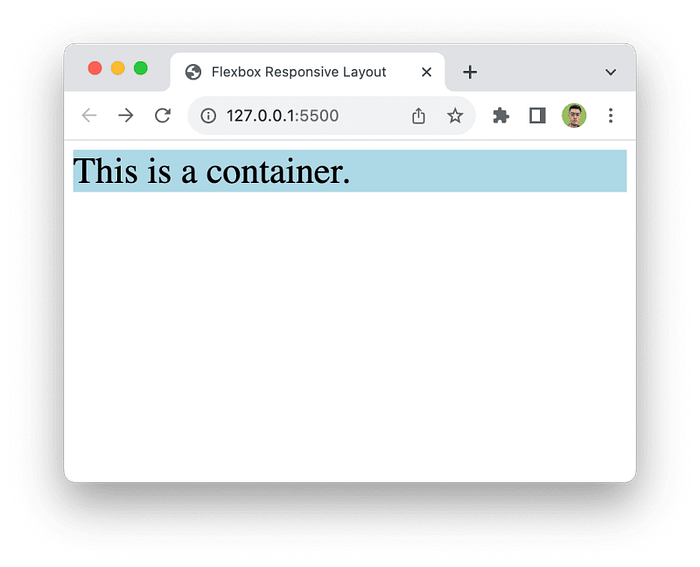
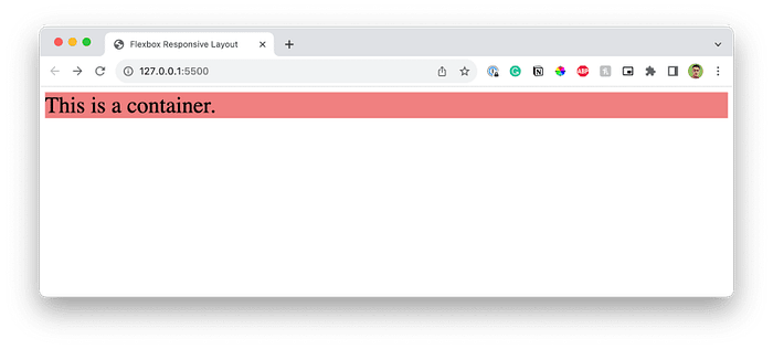
}In this example, the text background will be lightblue when the viewport is smaller than 640px. Now, resize your browser, and when the viewport is larger than 640px, the background will turn into lightcoral.
⬇️ Smaller than 640px
⬇️ Larger than 640px
The font size remains the same even though we did not define a font-size property for the min-width: 640px media query. The property will simply be inherited from the original .container styles. You may check what CSS styles are active using your browser's developer tools.
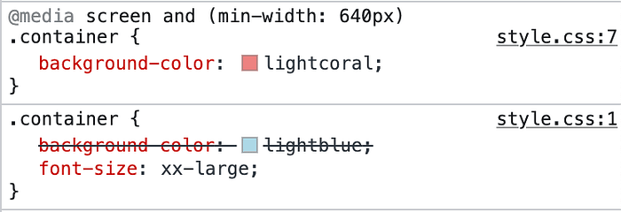
Notice that the background-color: lightblue; style has been crossed off, meaning it is not currently active, but the font-size: xx-large; style is.
The 640px we are using in this example is a commonly used breakpoint separating small screen devices (such as smartphones) and others. Usual breakpoints include:
@media screen and (min-width: 640px) {
  /* Small devices such as smartphones */
}

@media screen and (min-width: 768px) {
  /* Medium devices such as tablets */
}

@media screen and (min-width: 1024px) {
  /* Large devices such as laptops */
}

@media screen and (min-width: 1280px) {
  /* Largest devices such as desktops */
}
Notice that in these examples, we are only using min-width as the condition. This is because when designing responsive webpages, you should always follow the rule of mobile first, meaning you always start with the smallest viewport and work your way up to the big screens. You will see this in action later.
Creating responsive page layouts
Of course, for a real-life project, things are much more complicated. But don’t worry, we’ll discuss more about media queries with real examples. In this section, we will create responsive page layouts that adapt to the viewport sizes using media queries, flexbox, grids, and other technologies.
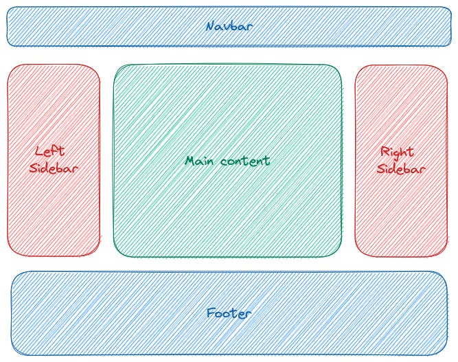
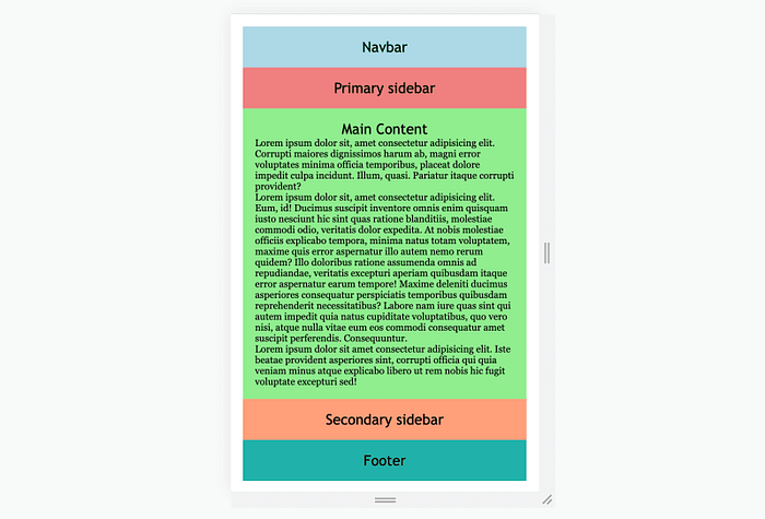
For demonstration purposes, we’ll build a responsive page layout with a navigation bar, two sidebars (left and right), a main content section, as well as a footer, as shown in the diagram below.
The HTML code is rather simple:
<!DOCTYPE html>
<html lang="en">

<head>
    <meta charset="UTF-8">
    <meta name="viewport" content="width=device-width, initial-scale=1.0">
    <title>Flexbox Responsive Layout</title>
    <link rel="stylesheet" href="style.css">
</head>

<body>
    <div class="container">
        <div class="nav">Navbar</div>
        <div class="side-primary">Primary sidebar</div>
        <div class="content">Main Content
            <p>. . .</p>
        </div>
        <div class="side-secondary">Secondary sidebar</div>
        <div class="footer">Footer</div>
    </div>
</body>

</html>
Before getting started with the layout, you should set box-sizing to border-box like we discussed in the previous chapter. * is a wildcard selector that selects all elements in the HTML document.
* {
  box-sizing: border-box;
  padding: 0px;
  margin: 0px;
}
I also added some decorative styles to make the webpage look better. You can create a different design if you want. I will skip this code in future examples.
div {
  font-family: "Trebuchet MS", "Lucida Sans Unicode", "Lucida Grande", "Lucida Sans", Arial, sans-serif;
  padding: 20px;
  text-align: center;
  font-size: x-large;
}

p {
  text-align: left;
  font-size: medium;
  font-family: Georgia, 'Times New Roman', Times, serif;
}

.nav {
  background-color: lightblue;
}

.side-primary {
  background-color: lightcoral;
}

.content {
  background-color: lightgreen;
}

.side-secondary {
  background-color: lightsalmon;
}

.footer {
  background-color: lightseagreen;
}
Using flexbox
Next, you can create a flexbox layout by setting display to flex. The flexbox layout is, in fact, responsive by default when you set flex-direction to row and flex-wrap to wrap, since the next element will automatically occupy the next row when there is not enough space.
.container {
  display: flex;
  flex-direction: row;
  flex-wrap: wrap;
}
Remember, we are following the mobile-first rule, so for small screens, each section should take up all the horizontal space available.
.container > div {
  width: 100%;
}
⬇️ Flex layout on small screen
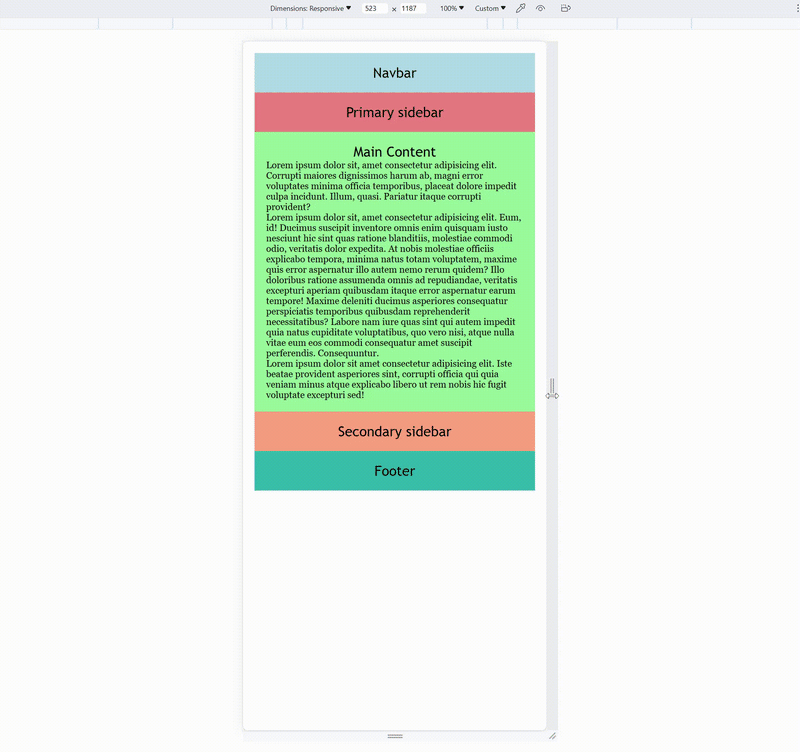
For medium size screens, the setup is a bit more complicated but also more flexible. For instance, you can keep the navbar and footer to occupy 100% of the horizontal space. And then, let the sidebar and the main content section take the same row. Here, I decided to hide the secondary sidebar to make more space for the main section.
@media screen and (min-width: 640px) {
  .nav {
    width: 100%;
  }

  .side-primary {
    flex: 1;
  }

  .content {
    flex: 3;
  }

  .side-secondary {
    display: none;
  }

  .footer {
    width: 100%;
  }
}
⬇️ Flex layout on medium screen
The flex property is a shorthand for flex-grow, flex-shrink, and flex-basis properties. flex-grow controls how much an element grows compared to other elements as the viewport grows. flex-shrink is the opposite, which defines how much an element shrinks as the viewport shrinks. And lastly, flex-basis defines the initial size of the element.
The flex property has the following syntax:
.element {
/* If one unitless value is given: flex-grow, flex-basis: 0; */
flex: 3;
/* If one value is given with unit: flex-basis */
flex: 10em;
/* Two values, unitless: flex-grow | flex-shrink */
flex: 3 3;
/* Two values, with unit: flex-grow | flex-basis */
flex: 3 100px;
/* Three values: flex-grow | flex-shrink | flex-basis */
flex: 2 2 10%;
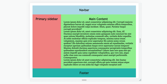
}For larger screens, the secondary sidebar should also be displayed. It will take up the same amount of space as the primary sidebar.
@media screen and (min-width: 1024px) {
  .nav {
    width: 100%;
  }

  .side-primary {
    flex: 1;
  }

  .content {
    flex: 3;
  }

  .side-secondary {
    display: block;
    flex: 1;
  }

  .footer {
    width: 100%;
  }
}
⬇️ Flex layout on large screen

Finally, let’s see this layout in action:
CSS grids
It is also possible to create the same layout using CSS grid instead of the flexbox. First, define the display type and create the columns using the grid-template-columns property.
.container {
  display: grid;
  grid-template-columns: 1fr 1fr 1fr 1fr;
}
Notice that we are using the unit fr, which means fraction. This example means we are dividing the page into four equal fractions, and each column takes one fraction. These relative units, such as %, vm, fr and others, are very useful for responsive web design.
On a small screen, all elements should take up all four columns:
.nav {
  grid-column: 1 / 5;
}

.side-primary {
  grid-column: 1 / 5;
}

.content {
  grid-column: 1 / 5;
}

.side-secondary {
  grid-column: 1 / 5;
}

.footer {
  grid-column: 1 / 5;
}
On medium screens, the primary sidebar takes one column, and the main content section takes three.
@media screen and (min-width: 640px) {
  .nav {
    grid-column: 1 / 5;
  }

  .side-primary {
    grid-column: 1 / 2;
  }

  .content {
    grid-column: 2 / 5;
  }

  .side-secondary {
    display: none;
  }

  .footer {
    grid-column: 1 / 5;
  }
}
Finally, on large screens, the sidebars each take one column, and the main content takes two.
@media screen and (min-width: 1024px) {
  .side-primary {
    grid-column: 1 / 2;
  }

  .content {
    grid-column: 2 / 4;
  }

  .side-secondary {
    display: block;
    grid-column: 4 / 5;
  }
}
Legacy layout method
Besides the flexbox and grid, there is also a legacy method called the grid view, which you can use to create responsive layouts. This method divides the webpage into 12 columns, each taking 1/12 of the entire width. You can then decide how many columns an element should occupy for different viewports.
.col-1 {width: 8.33%;}
.col-2 {width: 16.66%;}
.col-3 {width: 25%;}
.col-4 {width: 33.33%;}
.col-5 {width: 41.66%;}
.col-6 {width: 50%;}
.col-7 {width: 58.33%;}
.col-8 {width: 66.66%;}
.col-9 {width: 75%;}
.col-10 {width: 83.33%;}
.col-11 {width: 91.66%;}
.col-12 {width: 100%;}
Create the same grid view for medium and large screens.
@media screen and (min-width: 640px) {
  .col-md-1 {width: 8.33%;}
  .col-md-2 {width: 16.66%;}
  .col-md-3 {width: 25%;}
  .col-md-4 {width: 33.33%;}
  .col-md-5 {width: 41.66%;}
  .col-md-6 {width: 50%;}
  .col-md-7 {width: 58.33%;}
  .col-md-8 {width: 66.66%;}
  .col-md-9 {width: 75%;}
  .col-md-10 {width: 83.33%;}
  .col-md-11 {width: 91.66%;}
  .col-md-12 {width: 100%;}
}

@media screen and (min-width: 1024px) {
  .col-lg-1 {width: 8.33%;}
  .col-lg-2 {width: 16.66%;}
  .col-lg-3 {width: 25%;}
  .col-lg-4 {width: 33.33%;}
  .col-lg-5 {width: 41.66%;}
  .col-lg-6 {width: 50%;}
  .col-lg-7 {width: 58.33%;}
  .col-lg-8 {width: 66.66%;}
  .col-lg-9 {width: 75%;}
  .col-lg-10 {width: 83.33%;}
  .col-lg-11 {width: 91.66%;}
  .col-lg-12 {width: 100%;}
}
Apply this layout to our HTML document.
<body>
    <div class="container">
        <div class="nav col-12 col-md-12">Navbar</div>
        <div class="side-primary col-12 col-md-4 col-lg-3">Primary sidebar</div>
        <div class="content col-12 col-md-8 col-lg-6">Main Content
            <p>Lorem ipsum dolor sit. . .</p>
        </div>
        <div class="side-secondary col-12 col-md-12 col-lg-3">Secondary sidebar</div>
        <div class="footer col-12">Footer</div>
    </div>
</body>
Take the primary sidebar as an example. On small screens, the element will take all 12 columns (col-12). On medium screens, the sidebar takes 4 columns (col-md-4), and on large screens, the sidebar takes only 3 columns (col-lg-3).
Responsive layouts without media queries
All three layout methods we just discussed are widely used in real life, even the legacy method, which is still supported by many popular CSS frameworks. However, you may have noticed that it doesn’t matter if you are using flexbox, grid, or the grid view. You will need to use media queries to create breakpoints for different devices.
Today, electronic devices come in many different sizes. In our example, we only created two breakpoints for medium and large devices, but in reality, you probably need many more breakpoints than that. So, is it possible for us to simplify this process and create responsive layouts without using media queries? The answer is yes, but it does require some smart programming and an advanced understanding of CSS.
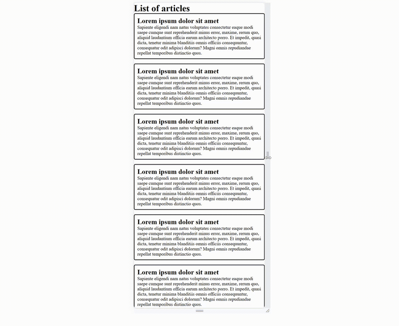
Say you are creating a webpage showing a list of articles using card components like this:
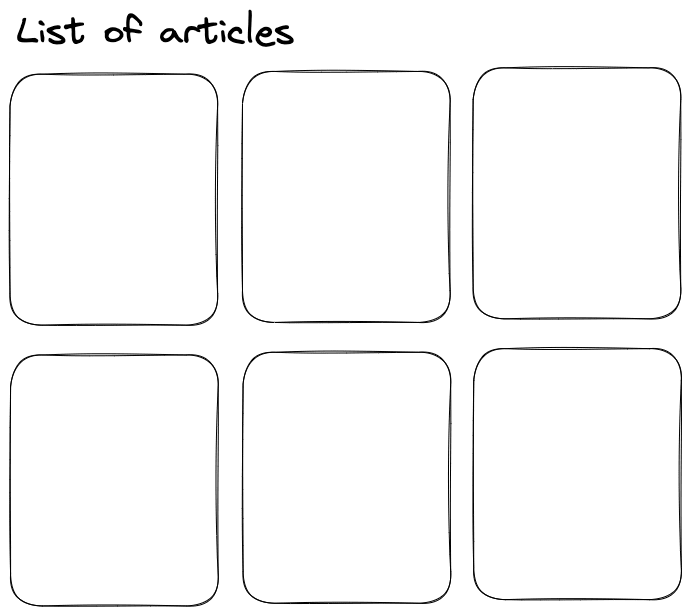
<h1>List of articles</h1>
<div class="cards">
    <div class="card">
        <h2>Lorem ipsum dolor sit amet</h2>
        <p>Sapiente eligendi nam . . .</p>
    </div>
    . . .
</div>
First of all, let’s think about how to create this list using grids. Assume each card is 20em wide, then you can automatically create the grid template using the repeat() function:
.card {
  border: 2px solid black;
  border-radius: 5px;
  padding: 10px;
}

.cards {
  display: grid;
  grid-template-columns: repeat(auto-fill, 20em);
  grid-gap: 1em;
}
The repeat() function creates a list of items based on the given values, which has the following syntax:
repeat(<number_of_columns>, <column_size>)In this example, the column size is 20em, and the number of columns is set to auto-fill, which means the browser will automatically find the maximum number of columns required to fill the entire row.
With this setup, you no longer need to use media queries, and the browser will automatically change the number of columns based on the viewport size.
However, this solution has one issue. Notice that when the viewport is not wide enough to fill an extra card, a very noticeable blank space will be left on the page.
In this case, you should ensure that each card also adapts to the viewport instead of being fixed to 20em. This can be achieved using the minmax() function.
.cards {
  display: grid;
  grid-template-columns: repeat(auto-fill, minmax(20em, 1fr));
  grid-gap: 1em;
}
The minmax() function gives a size that is greater than min (20em), and smaller than max (1fr) in order to fill the empty space.
Alternatively, you can go with a flexbox layout.

Responsive images
Besides the page layout, there are other aspects you must consider when creating a responsive webpage. One of the most essential components is the image. By default, the image will be displayed in a pixel-to-pixel manner. One image pixel matches one viewport pixel, which means the image will likely be either too large or too small for the current viewport. For an image to be displayed properly on any device, you should define a size with a relative unit such as % or vw.
img {
max-width: 50vw;
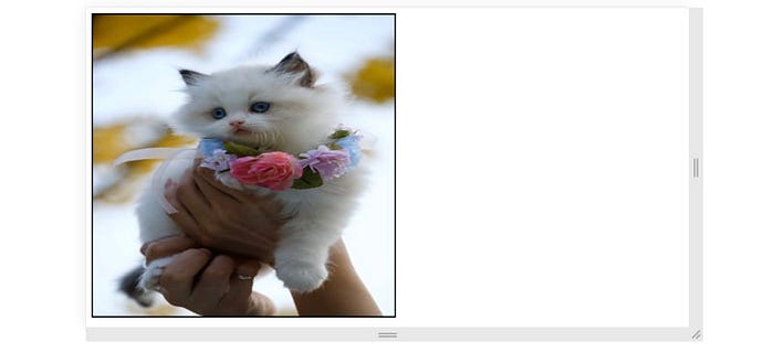
}Sometimes, an image must be displayed with a fixed aspect ratio. For example, a profile avatar usually has a 1:1 aspect ratio, but the photos might come in different sizes, especially for user-uploaded images. If you simply define an aspect-ratio property, the image will be stretched or squished.
img {
    max-width: 50vw;
    aspect-ratio: 1/1;
}
In this case, you can use the object-fit property to specify how the image should be displayed in the defined space.
- The default option,
fill, will stretch or squish the image to fit the given dimension.
img {
  max-width: 50vw;
  aspect-ratio: 1/1;
  border: 2px solid black;

  object-fit: fill;
}
containkeeps the image's original dimension and resizes the image to fit the space.
coverkeeps the image's original dimension, and resizes and crops the image to fill the space.
nonekeeps the image's original dimension and size.
scale-downkeeps the element's original dimension and scales the image down to fit the space. Unlikecontain, if the image is smaller than the defined space, it will not be scaled up to fit the space.
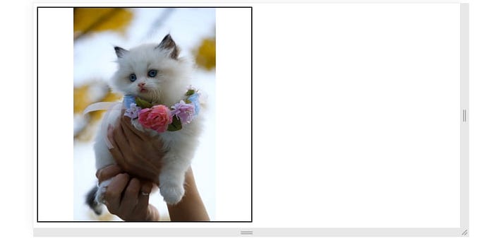
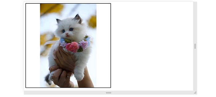
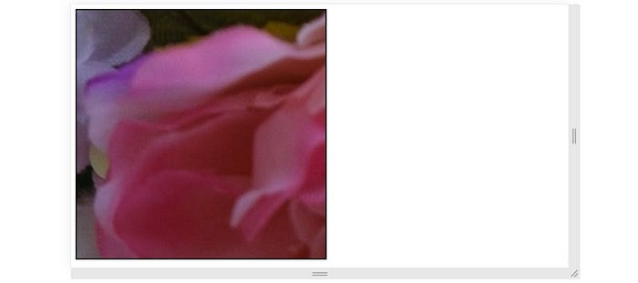
In order to use the image as a profile avatar, it is best to set object-fit to cover. Because it will not change the image's aspect ratio, and the defined space will be completely filled.
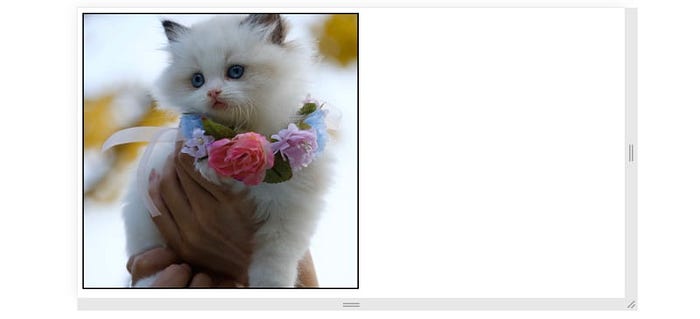
However, notice that the image is zoomed in on the center, which caused the cat’s ear to be cropped off. In this case, you could adjust the position of the image using the object-position property, which has the following syntax:
object-position: <horizontal_position> <vertical_position>;For example,
img {
  max-width: 50vw;
  aspect-ratio: 1/1;
  border: 2px solid black;

  object-fit: cover;
  object-position: 50% 10%;
}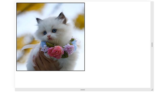
This CSS code will let the browser zoom in on the top portion of the image, which puts the cat at the center of the defined space.
Responsive typography
Lastly, we need to talk about typography. You should never set a fixed size for your fonts if the webpage is intended to be responsive. The font size that is suitable for large screens might not be appropriate for your smartphone, and the font size that is appropriate for your smartphone might be difficult to see on the desktop.
One common solution for this issue is to use media queries:
h1 {
  font-size: 2rem;
}

@media (min-width: 640px) {
  h1 {
    font-size: 4rem;
  }
}

. . .
But then, we face the same problem as before, there are too many breakpoints we need to create. Alternatively, you can define the font size using viewport relative units, letting the browser choose the best font size.
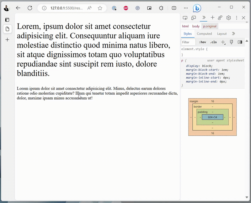
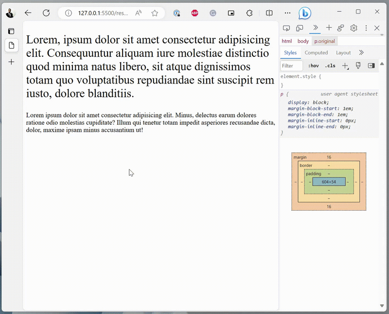
<body>
    <p class="responsive">Lorem. . .</p>
    <p class="original">. . .</p>
</body>
.responsive {
font-size: 5vw;
}
This method, however, will take away the user’s ability to zoom texts in or out because the font size is always relative to the viewport.
To fix this, you can use the calc() function to add two values together. If you add vw to a fixed value (em or rem), then the texts will be zoomable.
.responsive {
    font-size: calc(2vw + 1em);
}
Now, the texts will be responsive and zoomable at the same time.
Conclusion
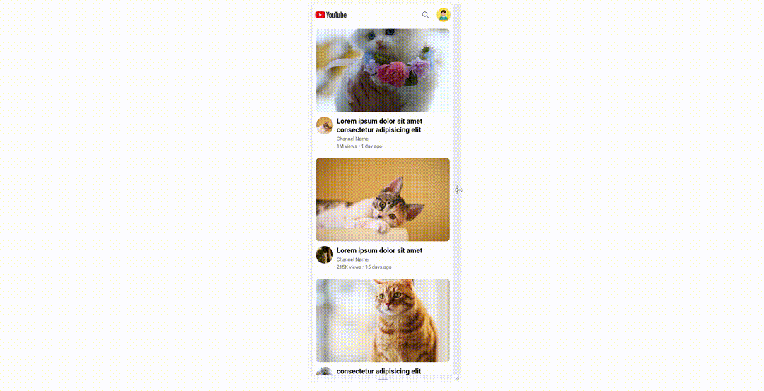
In this chapter, we discussed how to create a responsive webpage layout that adapts to different viewports, using technologies such as media queries, flexbox, and CSS grids. And we also explored how, in some cases, you can create responsive layouts without using media queries. Lastly, we wrapped up this chapter by discussing how to make images and typography responsive. In the following chapter, we will put everything we’ve learned so far together and recreate YouTube using raw HTML and CSS.
If you are interested, here are some of my other articles about CSS and frontend design:
This article is part of the course “HTML & CSS: A Practical Guide”.

