Theme management with datastore in Jetpack Compose
Using dark/light modes on your app could be a little bit chaotic, but with a couple of tools, we will be able to match the desired look and feel.
The wrapper
For having the ability to switch easily we are going to wrap our app with a custom theme manager, it will allow us to handle the state of the theme.
The wrapper will have a reference to the datastore to check when it’s changing and let know the entire app is changing. When the data changes the app will change.
For convenience, we will work with the approach Twitter uses on their app, basically, you can choose if you use your configuration, or if you use the system’s one.

We will relay also on the material design theme component, which has all the tools for making this a little bit easier.
@Composable
fun AppTheme(
    content: @Composable () -> Unit,
) {
    val context = LocalContext.current
    val viewModel = remember { ThemeViewModel(context.dataStore) }
    val state = viewModel.state.observeAsState()
    val value = state.value ?: isSystemInDarkTheme()

    LaunchedEffect(viewModel) { viewModel.request() }

    DarkThemeValue.current.value = value
    MaterialTheme(
        colors = if (value) AppDarkColors else AppLightColors,
        typography = AppTypography,
        shapes = AppShapes,
        content = content
    )
}

@Composable
@ReadOnlyComposable
fun isDarkTheme() = DarkThemeValue.current.value

@SuppressLint("CompositionLocalNaming")
private val DarkThemeValue = compositionLocalOf { mutableStateOf(false) }
DataStore/ViewModel
I will reduce this a bunch for getting just the idea, basically, for this example, we are going to just save a value true/false, according to the changes of this value the UI will be re-rendered. This basic view model uses live data to talk with the UI and stay up to date.
class ThemeViewModel(
    private val dataStore: DataStore<Preferences>
) : ViewModel() {
    private val forceDarkModeKey = booleanPreferencesKey("theme")

    val state = MutableLiveData<Boolean?>(null)
    fun request() {
        viewModelScope.launch {
            dataStore.data.collectLatest {
                state.value = it[forceDarkModeKey]
            }
        }
    }

    fun switchToUseSystemSettings(isSystemSettings: Boolean) {
        viewModelScope.launch {
            if (isSystemSettings) {
                dataStore.edit {
                    it.remove(forceDarkModeKey)
                }
            }
        }
    }

    fun switchToUseDarkMode(isDarkTheme: Boolean) {
        viewModelScope.launch {
            dataStore.edit {
                it[forceDarkModeKey] = isDarkTheme
            }
        }
    }
}
There are three functions here for some particular reasons, the idea is to listen to the changes on the datastore, and those changes will be propagated to the UI.
The palette/UI
Now we have the tooling we can start using this around our screens, first we can create some colors and a tool for having a color depending on the theme state.
val DarkBlue = Color.fromRGB("#0B1729")
val Silver20 = Color.fromRGB("#E5E5E5")
val SilverLight = Color.fromRGB("#F8F7F8")

@Composable
fun backgroundColor() = DarkBlue orInLightTheme SilverLight

@Composable
fun captionColor() = Silver20 orInLightTheme DarkBlue@Composable
@ReadOnlyComposable
infix fun <T> T.orInLightTheme(other: T): T = if (isDarkTheme()) this else other
orInLightTheme is just a fancy function for not writing if/else around the app.
Now you can theme all your Composables:
CustomText(
    text = "\uD83C\uDF19  Dark mode",
    color = captionColor(),
)
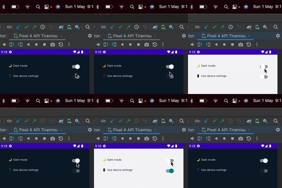
The settings screen/example
To see the full example please go to https://github.com/go-cristian/compose_theme.
This is a fast example of how you can handle it, and for sure in production, you will need to change a couple of things over here.

